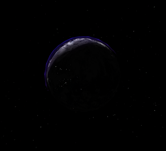
Real space is dark. In some ways, too dark to allow for fun gameplay. For example, when you approach the dark-side of a planet, it’s just blackness with a sliver of light on the edge. That’s cool and incredibly atmospheric, but it’s not really fun for the player when facing a game where everything is black.

The dark side of a planet is dark!
With that in mind, for Port Aphelion, I have been exploring various graphical approaches that will add more interest into the darkness of planets. Specifically, as you can see in the clip below, I’ve been adding things like “glowing lava” for planets with overly active tectonic plates.
From Port Aphelion (© 2021, John Pile Jr)
I’ve also been experimenting with light pollution and global events (lightning) that will help battle the monotony of the darkness. In the screenshot below you can see a hint of “city lights”

From Port Aphelion (© 2021, John Pile Jr)
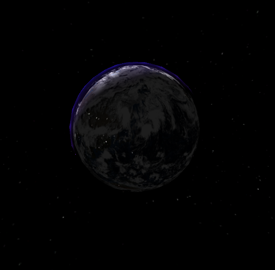
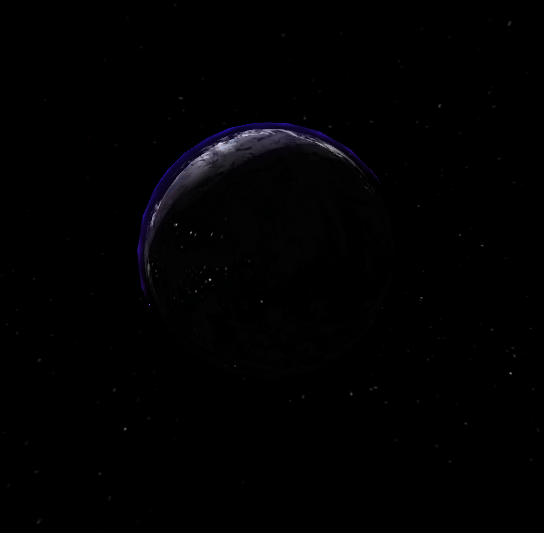
Of course the alternative is to just crank up the ambient light levels. And while I did experiment with this idea, the resulting reduction in contrast didn’t sit well with me. You can see side-by-side examples below (although this doesn’t show up well on some mobile phones.. trust me that on a good monitor it is significant)


From Port Aphelion (© 2021, John Pile Jr)
I greatly prefer strong contrast provided without ambient light. But the challenge remains to find ways to ensure the entire game isn’t just a black void.

